New Year's CSS Cleanup
I've been dabbling in a few updates to my site and one of the easy wins I've been able to accomplish over the past week is optimizing my site's stylesheets.
The plan was to:
- optimize CSS load times,
- group CSS by component,
- use CSS variables, and
- remove any CSS that is no longer used.
Gatsby combines all CSS into one file by default. Originally, I had planned to split CSS styles by page, but this issue on Github explains why Gatsby doesn't split CSS files. Because of this, I've decided to maintain one CSS file, layout.css.
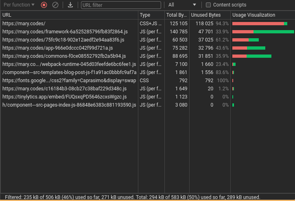
To benchmark my progress, I'll be using the coverage tool in Chrome.
The first item in the code coverage window contains the bulk of the CSS and JS for the home page of my site. It's a compiled HTML file combining all of the markup needed for the site. This includes all the CSS imported into the HTML <head>. You can see that 94.3% of that code is unused. That's a lot! Some of it might be JavaScript for old components, but I'm sure that a large chunk if it is unused CSS.
Optimizing CSS load times
This video, from Kevin Powell, convinced me to optimize my font stack for speed.
In summary, relying on system fonts is a great way to optimize load times because the browser doesn't have to do any extra work to download fonts. I've been relying on a self-hosted font for years for the majority of the text on my site. Glacial Indifference is a beautiful font, but I'm convinced to try system-ui fonts for a while.
I am still relying on one Google font for my site's header, which adds a small amount of overhead when fetching CSS.
@import url('https://fonts.googleapis.com/css2?family=Caprasimo&display=swap');The body font has been changed to the "system font stack" from the video. Part of the reason for doing this instead of just font-family: system-ui, sans-serif is that I was writing this article on my Chromebook and realized that I didn't like the Chromebook's default sans-serif font. Therefore, I'm forcing the system to use Roboto instead.
body {
    font-family: -apple-system, BlinkMacSystemFont, "Segoe UI", Roboto, system-ui, sans-serif;
This change also allows some additional specificity for other operating systems, specifically Windows and Mac.
Headers have been changed to use the Geometric Humanist font stack from Modern Font Stacks. Modern Font Stacks is a great resource for finding and comparing operating system fonts.
h1, h2, h3, h4, h5, h6 {
  font-family: Avenir, Montserrat, Corbel, 'URW Gothic', source-sans-pro, sans-serif;
}
In the future, I may add back in some self-hosted fonts or Google fonts to support different themes. Now that my CSS is organized, I look forward to adding more theming options than just light and dark modes.
In addition to removing self-hosted font, I've also removed the Font Awesome icon fonts that I was using sparingly on the site. I was foolishly adding huge dependencies that supported the use of about six icon glyphs. Instead, I'm making my own animated icons with CSS. (More on that in a future post.)
    // All removed!
    "@fortawesome/fontawesome-free": "^6.4.2",
    "@fortawesome/fontawesome-svg-core": "^6.4.2",
    "@fortawesome/free-regular-svg-icons": "^6.0.0-beta3",
    "@fortawesome/free-solid-svg-icons": "^6.0.0-beta3",
    "@fortawesome/react-fontawesome": "^0.1.16",
Grouping CSS by component
A large part of this effort was to combine multiple style declarations for a component into one declaration. I have a bad habit of abusing the "cascading" part of CSS to override values higher up in the file. It's fine for trying out new ideas. Sometimes I don't want to change CSS that I know works, so I redeclare things further down the file. However, when it comes to revisiting the file later, it's harder to figure out where the styles are being affected.
I've now re-worked layout.css so that pages and elements are now grouped together and added comments for wayfinding. The file is now organized with theme colors at the top, then HTML and body resets and typography styles, followed by header, navigation, main content, and individual page styles.
As part of the restructuring effort, I've also begun taking advantage of CSS nesting. As a longtime user of SCSS in my daily work, I'm a fan of nesting becoming part of the CSS specification. Unfortunately, support isn't great on any but the most recent browsers. However, this is my playground, and I want to use CSS nesting, so I will.
One place where I've added some CSS nesting was in my main content div.
#content {
  width: 100%;
  max-width: 800px;
  margin: 2em auto;
  padding: 1em;
  > div {
    margin-bottom: 3rem;
  }
  > ul {
    list-style: none;
    margin-left: 0;
    > li {
      margin-bottom: 1.5rem;
    }
  }
  #blog_posts, #favorite_posts {
    & p {
        margin-bottom: 1.5rem;
    }
  }
}
I've updated most of my pages to use this #content component. Other pages originally had the same content div with different IDs. Now, my site's content areas (not header or sidebar nav) will be structured with this content component. You can see that I've used child combinators, ">" to specifically style child elements for different pages. The home page is structured with divs that are given extra margin at the bottom. The blog list pages have been rewritten to use ul and li elements instead of divs.
The exception to this is article pages, like this one. Article pages have been written since the beginning using the <article> tag in an effort to use semantic HTML.
Using CSS variables
Again, since I've been using SCSS for a while, I'm used to using variables in my CSS. However, I haven't used variables much in regular CSS. In order to support different themes, I've added a few variables to my CSS.
/* Themes */

:root {
  --header: #4a4e69;
  --link-color: #9a8c98;
  --link-visited: #4a4e69;
  --sidebar-link-color: #9a8c98;
  --sidebar-link-active: #11112a;
  --sidebar-link-hover: #4a4e69;
  --lines: #f2e9e4;
  --text: #22223b;
  --background: #f4f3f2;
  --sidebar: #e4e3e2;
  --page-color-transition: background .2s ease, color .2s ease;
}

[data-theme="dark"] {
  --header: #c9ada7;
  --link-color: #c9ada7;
  --link-visited: #9a8c98;
  --sidebar-link-color: #9a8c98;
  --sidebar-link-active: #c9ada7;
  --sidebar-link-hover: #c9ada7;
  --lines: #f2e9e4;
  --sidebar: #22223b;
  --background: #11112a;
  --text: #f4f3f2;
}
As you can see, I have two different color schemes going on here, light (default) and dark. I've also changed the way the theme is applied to the site. Instead of using a class on the Gatsby wrapping element, I'm using a data attribute. I tend to be a CSS user who uses classes for all my styling, and I'm trying to branch out and use more interesting selectors like data attributes.
I've also added a transition to the default theme. As I was creating a nice theme fade transition after the initial CSS cleanup, I realized that I was repeating myself a lot with this property, so I added it as a variable as well.
I plan to add more variables as part of my CSS workflow going forward, and I hope to make some really cool themes in the future.
Removing unused CSS
So far, all of my optimizations have been manual changes, and this part is no exception. There are automated ways of removing unused CSS, but this file is relatively small, and I'd like to also take this opportunity to remove any unused components from my site as well.
There's nothing too much exciting here. I removed components that were works-in-progress and never finished. I also removed some components that I had used in the past but no longer use. Since I use WebStorm as my IDE, I was able to use the "Find Usages" feature to find any components that were no longer used.
A large chunk of CSS that I removed had been added when I first created this blog, as part of the blog template. It seemed like there were CSS resets for every obscure HTML tag. As I've built out my site, I've realized that I don't use most of these tags, so I removed them, and I'll add them back as needed.
Final results
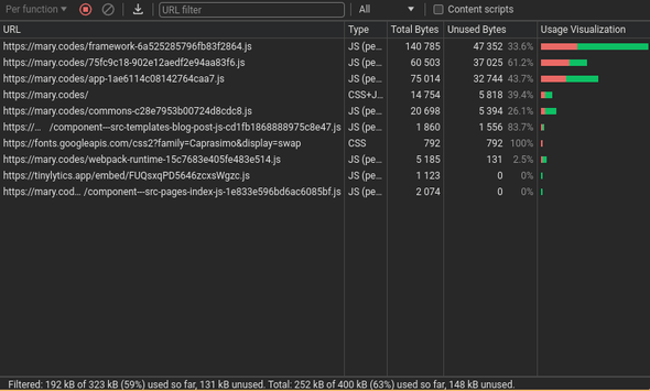
Running the coverage tool on the live site, post-deployment, shows some very interesting changes.
Since this window is sorting by unused bytes, our main compiled HTML file is now on the fourth line. The file now only has 39.4% unused code, down from 94.3%!
| Main HTML compiled file | ||
|---|---|---|
| Metric | Before | After |
| Total Bytes | 125,105 | 14,754 |
| Unused Bytes | 118,025 | 5,818 |
| % of Unused Bytes | 94.3% | 39.4% |
| Used Bytes | 7,080 | 8,936 |
| Site-wide files | ||
|---|---|---|
| Metric | Before | After |
| Total Bytes | 505,975 | 322,788 |
| Unused Bytes | 271,426 | 130,812 |
| % of Unused Bytes | 53.6% | 40.5% |
| Used Bytes | 234,549 | 191,976 |
While the sizes of the other loaded files have remained mostly the same, that main compiled file has been reduced significantly, resulting in faster load times and a much smaller bundle size. At the same time, I've made my CSS easier to work with and cleaned up some errant React components as well.
My site was already relatively fast, and it can be argued that I didn't need to make these optimizations. However, it was a great way to reinforce good habits and learn some new CSS tricks. Best of all, these optimizations will make developing new features even easier!

